
Applications
The brand system in use. How logo, claim, typography and tone come together on real touchpoints.
The system shows itself in use.
Applications aren't decoration, they're proof the brand holds up. Every touchpoint anchors which rules and which lines apply where.
Place before network
A single store card speaks of the place. It uses the master claim and the local line, not the network line "all across Europe". That belongs on brand-wide assets.
Claim like a logo
ADVANTAGE YOU. stands as a self-contained unit with a full stop. On dark backgrounds YOU. is yellow, on light YOU. is black on a yellow surface, on yellow the claim is fully black.
Yellow, dosed
Yellow as a surface is allowed as a signal, dosed. On yellow always use the black wordmark, never the logo that contains yellow.
Store business card, name-neutral. Info side with all store details, back as a brand surface.

- Mobile
- [Phone]
- [Email]
- Web
- tennis-point.xx
- Store
- [Address · ZIP City]

Which lines
Master claim ADVANTAGE YOU. on top, local line "This is your home court." in yellow. No network line on the single-store card.
Logo on yellow
The back is a full yellow surface with a centered black wordmark so the logo holds.
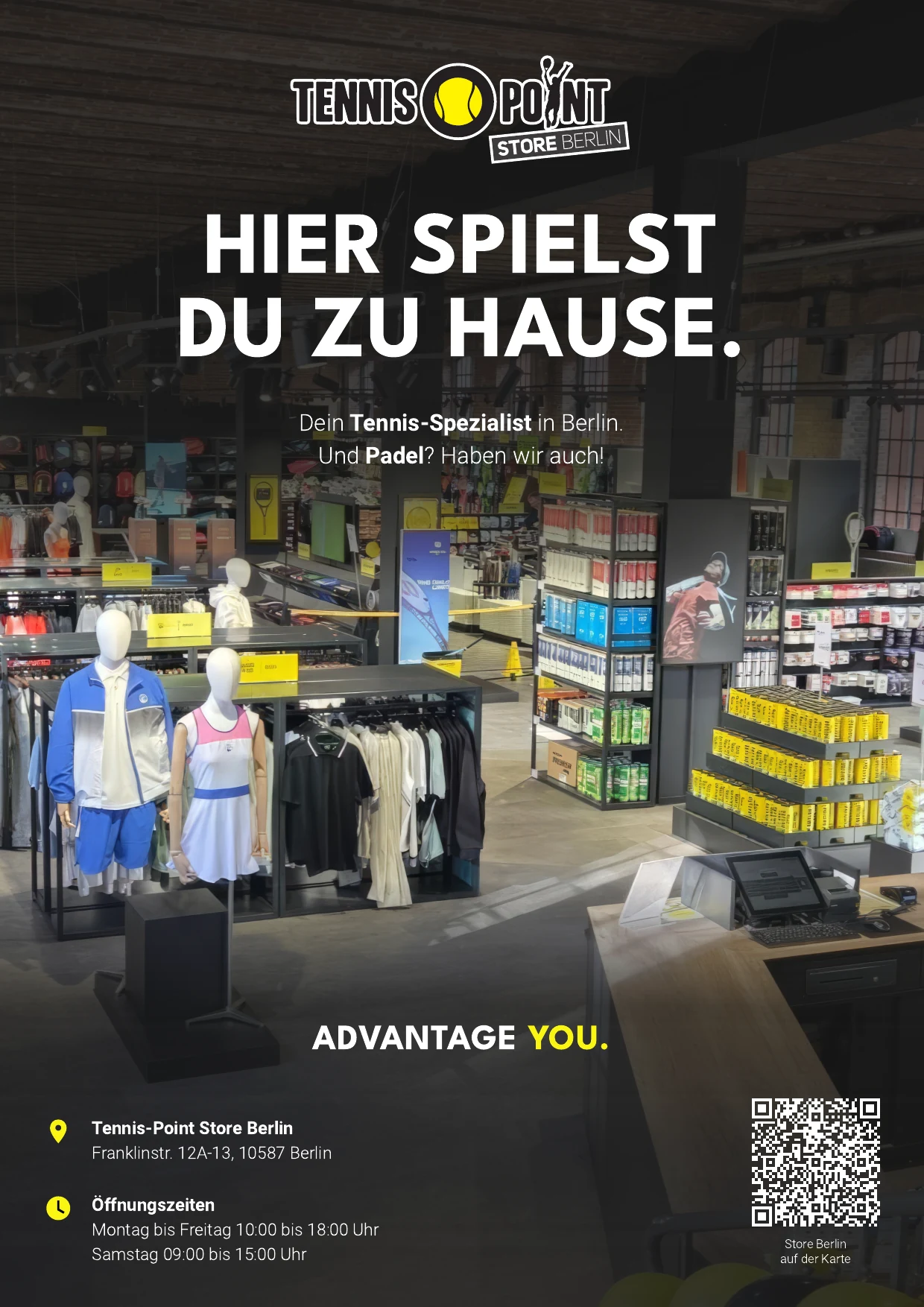
An A4 ad for a tournament magazine. It shows how logo, location line, claim and store details come together on a printed piece.
Which lines
The location line “Hier spielst du zu Hause.” carries the headline, the master claim ADVANTAGE YOU. sits in the lower third above the store details. No network line: for a single location, place comes before network.
Image and gradient
The image bleeds across the full page. Two gradients darken the head and foot only, leaving the image open in between. Their combined height must never exceed the page height, otherwise they overlap into a general darkening and the image sinks.
In preparation. Added as artwork and templates are ready: flat templates right here, physical objects as photorealistic renders.
Racket Bag
In preparationPOS packaging, first physical touchpoint carrying the claim.
Window & Signage
In preparationStorefront and wayfinding, place and orientation.
Digital & Social
In preparationStore profiles, local posts, store finder.
Team Apparel
In preparationStaff presence in the store.
Packaging & Bags
In preparationBags, boxes, inserts.