Logo System
Two elements, one system.
Wordmark
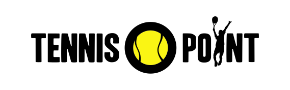
The full wordmark with integrated tennis ball. Primary brand identification.
Use for: Standard for all touchpoints: website header, documents, campaigns, print.

Ball Logo
The tennis ball as a standalone brand element. Compact identification.
Use for: As icon, favicon, app icon, social profile picture, or as reminder where the brand is already established.







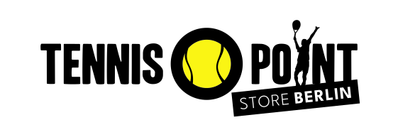
Store Logo
The store logo identifies a single location: the wordmark with an angled badge carrying the place name. Use it only in media that point to that specific store, such as store cards, local ads, Google Maps, local social accounts and appearances at tournaments nearby. The store itself never carries it: facade, shop windows, signage and interior use the wordmark without a place name. Anyone standing in front of the store knows which city they are in. At a tournament nearby they do not know whether there is a store in town, and that is exactly what the badge says.
Example: Store Berlin

Construction
- Label in light, place name in bold behind it, both set in Courtside Sans and in capitals only. The place is the information, so it carries the weight.
- The badge is flush with the right edge of the logo. It is not centred.
- Its top right corner sits at the foot of the T in POINT and is also the pivot point. Angle 6 degrees.
- The badge height is fixed at 7.6 per cent of the logo width and is identical for every location.
- The width grows with the place name but stops at the right edge of the ball. The ball stays clear.
- If a name does not fit, the type scales down, not the badge.
Why the badge sits at an angle
The logo has no reliable centre axis. TENNIS is wider than POINT, which puts the ball to the right of the optical centre. Any centred solution would have to commit to one of the two axes and ends up looking off. The angled badge does not centre at all, so it needs no centre axis.
Long place names
If a name grows so long that the badge would run into the ball, the word STORE is dropped and the first word of the name takes over its light label position. This keeps the same hierarchy across the whole set: OUTLET STEINHAGEN, VALENCIA ALFAFAR. Setting the entire name in a single weight, or extending the badge across the ball, is not permitted.
Minimum size
- 80 mm
- Digital
- 560 px
Considerably larger than for the wordmark (35 mm or 220 px), because the place name is set small and shrinks further on long names. The worst case in the set sets the limit, so that several store logos side by side stay consistent. If space is tight, do not scale the lockup down. Use the plain wordmark and name the location in the copy instead.
Which place name applies
The place name follows the store finder on tennis-point.de, not the postal address. Where the two differ, the market name applies, for example Zürich for the location in Dietikon. Where a city has two locations, the second one carries an addition, such as STORE SCHLACHTENSEE in Berlin.
How to obtain files
Store logos are supplied centrally and must not be modified or rebuilt locally. Never set the place name yourself: typeface, size, angle and position all follow the construction. Files are stored per location on the graphics server, split into Digital RGB and Print CMYK. Request them from brand management.
Clearance Zone & Minimum Sizes
Reference Unit
1T = cap height of TENNIS in the wordmark. Reference edge is the full logo bounding box including silhouette and ball icon.
Minimum: 1T
Only when the format forces it. Applies to space-critical use cases.
Recommended: 1.5T
Default for hero and brand-presence applications. Reduce only when necessary, not out of convenience.
Minimum Sizes
Do / Don't
The logo's shape, color, proportions and clear space stay untouched. These alterations are not allowed.
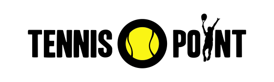
Correct
Correct variant, clear space kept
Wrong
Don't stretch or squash
Wrong
Don't recolor
Wrong
Don't rotate or tilt
Wrong
No shadows, glow or effects
Wrong
Don't violate the clear space
Wrong
On dark backgrounds use the outline variant
Aligning text with the logo
The wordmark has no reliable centre axis: TENNIS is wider than POINT, so the ball sits right of the optical centre. Text centred below or above the wordmark therefore looks off. When wordmark and text form a block, the block is left-aligned on the ink edge of the wordmark. Only a headline without the wordmark is centred.
Brand Update
From Brand & Creative
Correct
Left-aligned on the ink edge
Brand Update
From Brand & Creative
Wrong
Centred below the wordmark
No-Gos
- Logo as watermark on every image
- Logo on visually crowded backgrounds
- Logo smaller than minimum size
- Ball icon as substitute for the wordmark in formal contexts
- Free variations of the claim ('Advantage Us', 'Advantage Tennis')
- Claim fixed to the logo as a lockup - 'Advantage You' is used independently
- Mixing color variants that are not defined as official variants
- Using the white-only or black-only logo without yellow – technical exception only (engraving, embossing, b/w print). Yellow is a fixed brand component and is used whenever possible.
- Setting text centred below or above the wordmark
- Logo on banners in our own newsletter: the channel already names the sender. The logo only belongs where sender identification is missing, e.g. in paid ads to audiences who do not know the brand yet.